What should you do if you have a button that isn’t active in a given context? Removing the button from its native location and revealing it later can surprise users. Instead of doing this, designers will indicate that it’s disabled to avoid displaying a drastic change to the interface.
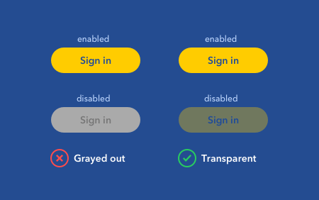
The way most designers communicate a disabled state is by graying the button out. However, this approach also surprises users because the button’s enabled state has little resemblance to the disabled one.

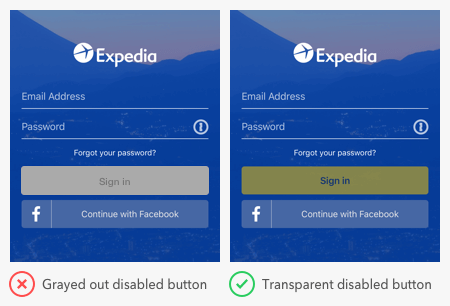
A button that turns from gray to fully colored is an unexpected change that makes users wonder what just happened. For a smooth and seamless experience, it’s best to avoid this. Instead of graying out your disabled buttons, you should decrease the opacity to make it transparent.
When the disabled button is transparent, users can see some semblance of the button in its enabled state. Although the button is faded out, some color still bleeds through for users to recognize. As the disabled button transitions to its enabled state, the new appearance won’t catch users off-guard.
A transparent button blends into the background more, while a gray one remains in the foreground (unless the background is gray). Foreground elements are more noticeable to users. They tend to view them as interactive, which means they’re more likely to interact with a grayed out disabled button.

Users are less likely to confuse a transparent button with other buttons. A gray button doesn’t always mean it’s disabled. Sometimes gray is used to communicate a low priority button in a group (e.g., cancel buttons). Users can easily mistake a grayed out disabled button for a secondary call to action. Or, worst-case scenario, they can mistake it for a poorly designed button with low color contrast.
When designing disabled buttons, adjust the opacity, not the color. The optimal opacity values will vary based on your background color. But a rule of thumb is to aim for an opacity level of 40% or below. It’s important to make the opacity level low enough, or some users may still view the button as enabled.
By following this technique, you’ll make your disabled buttons look disabled without giving users any surprises. Instead, the only surprise they’ll get is how smooth and seamless your interface is.


