To tap or not to tap—that is the question on the user’s mind when they see a call to action button.
The more buttons there are, the longer it takes them to make a decision. They have to examine each button to determine which one best meets their goal. Any uncertainty or doubt about the buttons could cause them to take no action or the wrong action.
You can prevent this by making the priority of each action intuitive. When users can see which button is important to their task, they’re able to take action right away. There are a few UX techniques you can use to make a big difference on the intuitiveness of your call to action buttons.

Order Buttons According to Scanning Pattern
One common mistake made on apps is placing buttons in an order that diverts from the user’s natural scanning pattern. They place their highest priority button first because they want users to notice it first. But users will notice the button regardless of the order as long it carries visual weight.
Button order is not to aid visibility, but to aid efficiency. Placing the high priority button first causes users to reverse their scanning direction from top-down to bottom-up, which breaks their natural flow.
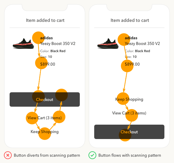
Instead of forcing users to rescan buttons, allow them to get to the high priority action with a scan in a single direction. This allows users to scan every button option in order before they make a decision.
By placing the high priority action at the bottom, it’s in the path of least visual resistance which makes it quick and easy to tap. Also, the bottom location is the easiest for the finger to reach, which further improves efficiency.
Distinguish Buttons from Text with a Shape
Another mistake made on apps is using text only to represent a button. Designers use text buttons to show which actions are lower priority. But this is a poor choice for call to actions because the text doesn’t have the appearance of a button. This can cause users to overlook those actions and only see the primary one.

Text buttons also cause confusion by making users wonder if the text is a button or information. This uncertainty can lead them to skip those buttons.
Not only are text buttons confusing, but they’re also smaller tap targets. Placing the text label inside a button shape makes the call to action easier to notice and tap.
Button shapes are a better way to subdue low priority actions than text buttons. They make every option easy to recognize for users to meet their goal in their preferred way.
Add Color to Progressive Actions
The high priority action is easiest to identify—it’s the action that leads directly to the user’s goal. If you’re unsure about the remaining actions, think about which one progresses users toward their goal and which one regresses them.
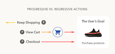
In the example, “checkout” has high priority because it takes users to their goal. But it’s not as clear which action has medium priority—“view cart” or “keep shopping”.
The “view cart” action takes users to view the items they added to their cart, which then leads to checkout. The “keep shopping” action takes users back to the product pages further away from the checkout option.
By examining the actions, it’s clear that “view cart” has a medium priority and “keep shopping” has a low priority. It’s easy to see which action progresses users toward their goal and which one regresses them from it.
Progressive actions are always higher priority than regressive ones. As such, they deserve more visual weight and higher color contrast.

Color is an effective way to denote progressive actions because it stands out from the text color and grabs the user’s attention. When the color of the button is the same color as the text, the signal is not as strong. Adding a distinct color to progressive actions signifies the action users should take.

If you use the same color for each progressive action, users won’t know which one has higher priority. And using different colors for each one would only confuse users more and cause them to wonder what the different colors mean. Not only that, but it would also give each button the same visual weight.
The trick is to use the same hue but vary the saturation and brightness on the medium priority action so that it looks lighter than the high priority action. Now the weight of the buttons are no longer competing and there’s a clear winner.
To enhance the contrast more, you can invert the display polarity. Use light text on a dark background for the primary button and dark on light for the secondary one. This gives the high priority action a brighter text label and the highest contrast.
Vary the Boldness of Text Labels
Applying the current techniques is enough to distinguish priority, but there’s more you can do. The more intuitive you make each button the less the user has to think.

Using the same boldness on each text label puts the same amount of emphasis on them. It’s better to emphasize each text label differently based on priority. Vary the boldness of the text labels so that high priority buttons are the boldest and low priority buttons are the least bold. This way the weight of the text labels even indicate priority when users read them.
The example shows you how the “checkout” label is bolder and brighter than the rest. The “view cart” label is semibold and “keep shopping” label is medium. As a result, the text labels reflect the visual weight of each action. The text indicating “3 items” in the “view cart” label isn’t bolded because it’s supplemental information that doesn’t represent the action taken.
Give the High Priority Action an Icon
The last technique is the cherry on top that will make your buttons accessible to color blind users. Color blind users won’t be able to tell the difference between the weight of buttons. They need something more than color to serve as a visual cue.

Giving the high priority action an icon adds the extra emphasis to set it apart. When users scan, they often fixate on visual elements more than text. The icon ensures that all users will pay more attention to the high priority action than the other ones.
If you removed the color and label, users would still be able to recognize the checkout button. The icon communicates checkout as well as the text does.
Are Your Buttons Intuitive?
Your buttons aren’t intuitive if users are spending a long time on the action screen, or if you’re getting a low click through rate. If this is the case, use these techniques to sharpen the UX of your call to action buttons. You’ll see a big difference between the before and after version.
