Every interface has a subset of users that make up the majority and minority. The majority of users usually have normal vision, while the minority have some form of visual impairment.
There’s a big difference between what normal visioned users see versus what color blind and low vision users see. These users tend to experience blurry text and faint elements when text sizes and color contrasts are too low.
The goal of accessibility is to meet the needs of the minority because they’re often forgotten. But what happens when meeting the needs of the minority ends up failing the needs of the majority? This issue occurs when the interface is made too accessible and isn’t balanced with aesthetics.
Aesthetic Vs. Accessible
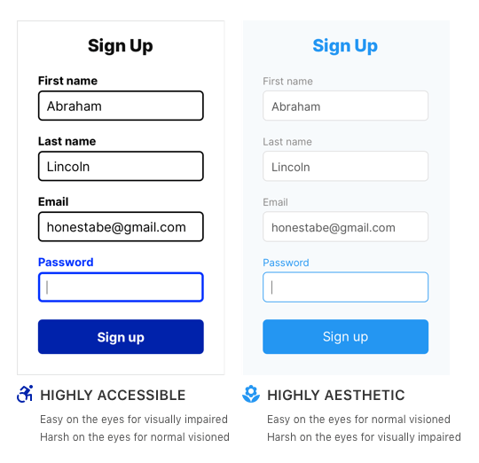
In general, the more accessible an interface is, the less aesthetic appeal it has. Highly accessible interfaces are easier on the eyes of the visually impaired, but harsher on the eyes of the normal visioned. On the flip side, highly aesthetic interfaces are easier on the eyes of the normal visioned, but harsher on the eyes of the visually impaired.
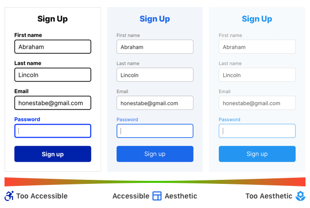
This aesthetic-accessibility paradox is what designers struggle with when they design interfaces. The challenge is to meet the needs of both the majority and the minority. However, if you veer too far into one extreme, you’ll alienate a subset of your users. Most people don’t want to alienate the minority. But alienating the majority of your users is just as bad as alienating the minority.
Below are two forms that illustrate this concept. One form is AAA compliant and accessible to all visually impaired users. The other is not accessible at all but appeals to normal visioned users.

For the normal visioned, the aesthetic form is easy on the eyes, while the accessible form is harsh. However, for the visually impaired, the accessible form is easier on the eyes, while the aesthetic form is harsher. Which form should you use?
The correct answer is neither because neither form respects the aesthetic-accessibility paradox. They are designed toward opposite ends of the spectrum, which will either alienate the majority or minority.
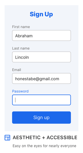
A truly accessible and aesthetic interface falls somewhere in the middle. Below is the form that respects the aesthetic-accessibility paradox. The color hues, contrasts, font sizes, and weights are AA compliant and balanced to meet the needs of both user groups. The result is an interface that’s easy on the eyes for nearly everyone.

The Majority of the Minority
Why isn’t an interface that’s balanced with aesthetics and accessibility easy on the eyes for everyone? Within the subset of the minority, there’s another majority and minority. The majority of the minority are users who don’t have extreme visual impairments and will be able to use a balanced design. However, the minority of the minority have extreme visual impairments that will still cause them issues.

Designing for the smallest minority will make your design accessible to users with extreme visual impairments. However, your design will alienate normal visioned users who make up the majority of your base. For this reason, the best design is a balanced one that satisfies the largest minority.
What about the needs of the smallest minority? Most users with extreme visual impairments use screen readers that provide high contrast modes. These high contrast modes allow them to use interfaces that have low contrast. It’s not necessary to design for the minority of the minority, but rather the majority of the minority. Designing for the largest minority means making your interface AA compliant.
Local High Contrast Mode
Sometimes a highly aesthetic or highly accessible interface is required based on the nature of a project. There’s a way you can provide users with these presentations without alienating any of your audience.
If you want to maintain a highly aesthetic design, you should provide a local high contrast mode on your interface. A local high contrast mode is a toggle button on the page that allows users to enhance the contrast of text and elements. On the other hand, if you want to provide users with a highly accessible design, make your high contrast mode AAA compliant.
However, the challenge is getting users to notice and use it. Make sure it’s visually prominent, or they’ll overlook it. The example below shows a button for high contrast mode, but it’s in an obscure form and location. If you decide to implement a local high contrast mode, follow these guidelines.

The Importance of Aesthetics
Accessibility extremists tend to discount aesthetics. They believe an interface should be as accessible as possible for the minority without considering how it affects the average user. These extremists need to understand and respect the aesthetic-accessibility paradox before demanding the highest degree of accessibility.
Aesthetics isn’t a subjective and trivial attribute used for ornamentation. It serves an important purpose in the user experience. It determines whether users trust your app, perceive it as valuable, or are satisfied using it. In other words, aesthetics affects user engagement and conversion rate. Discounting it is not only bad for users, but bad for business.
Striking a Balance
Balancing aesthetics and accessibility isn’t easy, but it’s necessary for a great user experience. The cross-section of the aesthetic-accessibility spectrum is the balance point for designing interfaces that satisfy the most users. Avoid designing at the extreme ends of the spectrum and respect the aesthetic-accessibility paradox.

Being mindful of this paradox will help you make design choices that include the visually impaired, without excluding the normal visioned. When you’re designing for a wide range of people, extremism toward either an aesthetic or accessible direction is not the best approach. Finding the middle ground is the best way to reach and satisfy as many users as possible.